It all started with a simple red pack and a single apple. Let me introduce you to Fruut, a brand that has grown from a simple idea into an international name, guided by thoughtful branding and a careful, step-by-step repackaging journey. What started as a small presence on local shelves has become a story of design, strategy, and connection with consumers.
Fruut is a Portuguese brand of 100% natural dried fruit snacks, with no added sugar or preservatives. It was created with one goal in mind: to be the healthy snacking option for everyday life. Riding the growing trend of healthy eating and responding to the modern need for convenience, Fruut found its sweet spot — healthy, easy, and accessible snacking.
What follows are the different packaging phases Fruut went through.
D’FRONT was not involved in the first two, but here’s our take on the brand’s journey.
Phase 1 — The Healthy Product
In the beginning, Fruut launched with a classic dried fruit look — a simple pouch bag with a zip-lock. It was straightforward, natural-looking, and easy to understand — a kind of artisanal feel.
Problem:
It wasn’t appetizing. Too generic, no clear identity, no brand presence — it looked like a private-label product.
Once the team realized the brand’s potential, Fruut decided to give its packaging a lift.
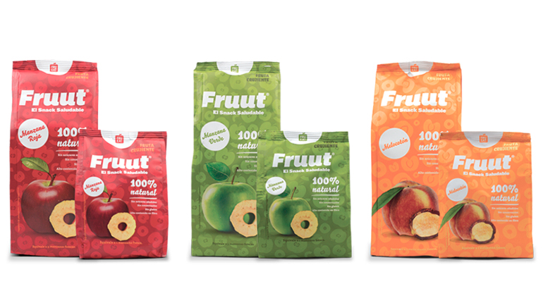
Phase 2 — The Product with Identity
Starting with the format, the packaging evolved — now we finally had a snack bag. Some patterns appeared, a few discreet claims, and the familiar apple slice illustration. This version was designed to target a niche of “health-conscious mums” and sit proudly in gourmet aisles. The brand grew, expanded, and started winning hearts — and shelves.
Problem:
Low perception of flavor and somewhat boring packaging.
Consumers understood that Fruut was natural, vegan, and had no added sugar — but that wasn’t enough to make them buy it. It turns out people want healthy products, but they don’t want to give up taste and pleasure. With pastel tones and soft typography, the design gave off a “low-flavor” impression.
There were also communication inconsistencies — Fruut had an active, bold, and dynamic voice, yet its visual image (starting with the typography) felt classic, outdated, and too “cute”.
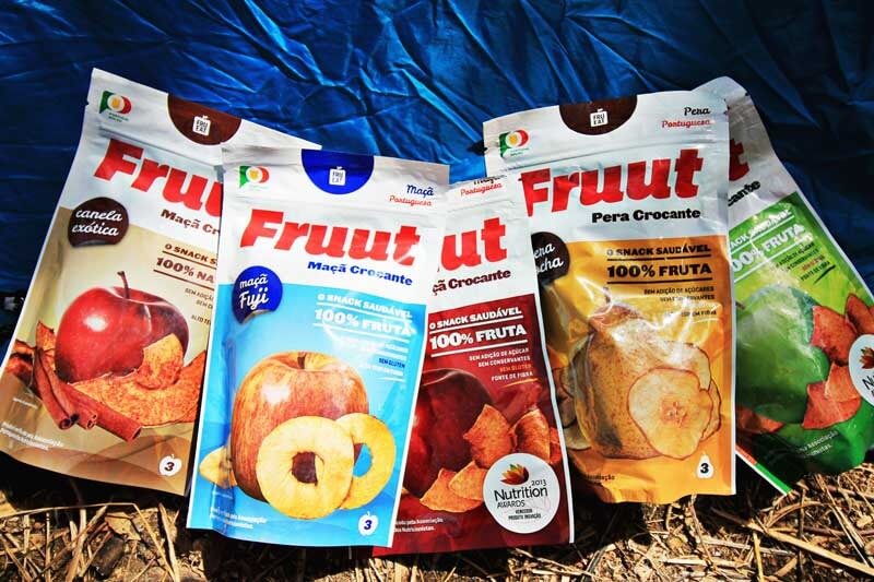
Phase 3 — Flavor Explosion
At this stage, Fruut had the opportunity to redesign its packaging while reducing plastic by 48%, reinforcing its ecological mindset and sustainable intent. To celebrate that milestone, Fruut partnered with D’FRONT, challenging us to redesign the entire range — more vibrant, more dynamic, and to finally prove that healthy doesn’t mean tasteless. Under the motto “Explosion of Flavor”, we created bright, energetic packaging that stood out on the fruit aisle shelves.
It was a strong upgrade from the previous gourmet niche positioning. Fruut now represented the convenient fruit snack — peeled, ready, and with a one-year shelf life.
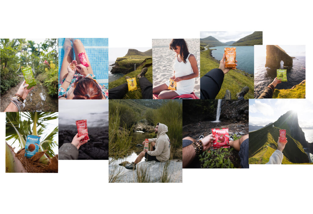
The result was incredible. The brand took off across all distribution chains. With the help of musician Diogo Piçarra’s campaign, and new product lines like Enfrutado and Fruut Kids for schools, Fruut gained massive exposure, winning clients globally reaching to a point were we had 12 different languages printed on a single pack.
Problem:
None — just the realization that Fruut was ready to grow and take on the big players.
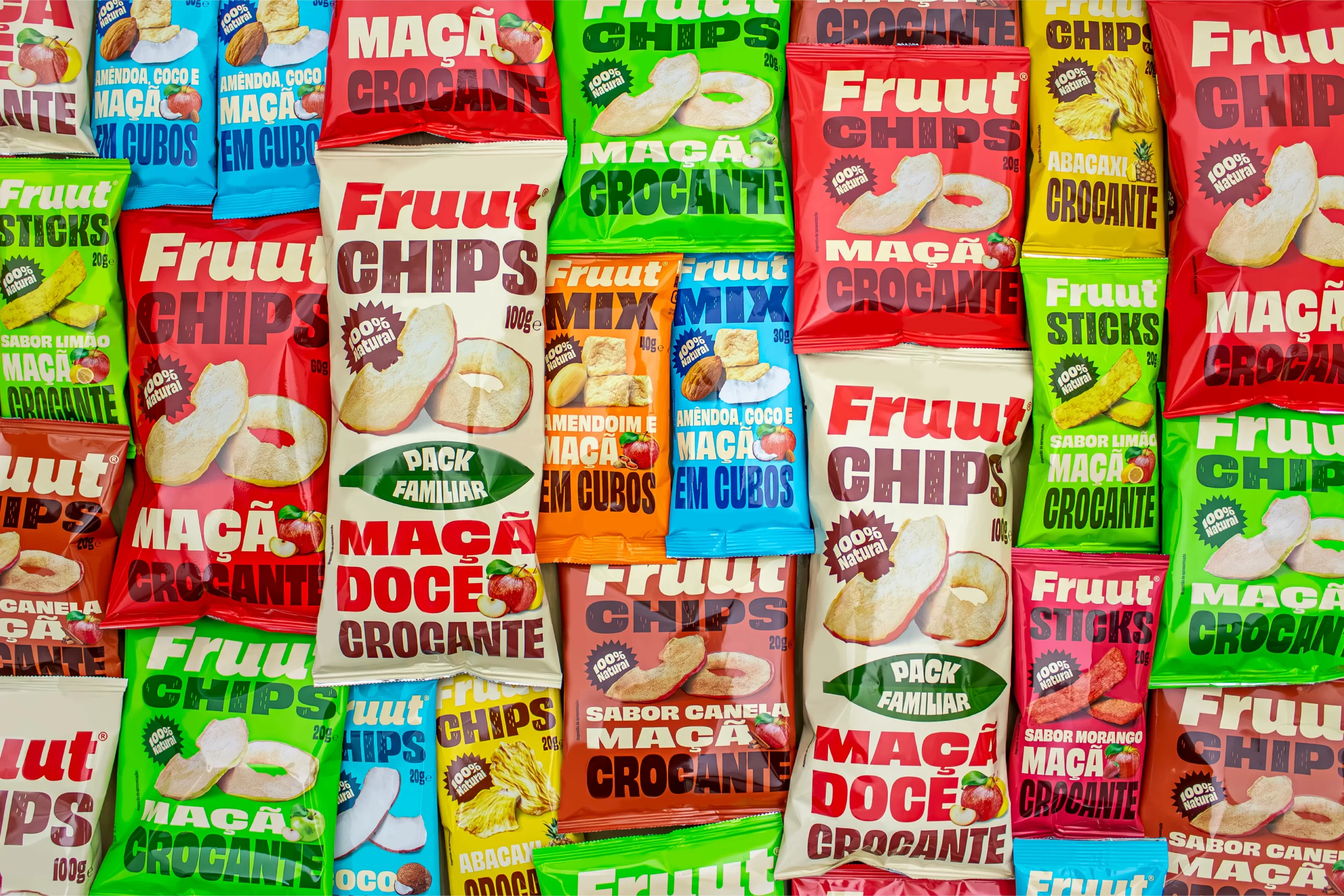
Phase 4 — The Snack of Snacks
With strong traction across major markets — supermarkets, convenience stores, and gas stations — it was time to compete in the big league of impulse snacks. After almost ten years of working together, Filipe (Fruut’s CEO) told us “Guys, I’ve got one hell of a challenge for you. When can we meet? Rebranding Fruut — we want to be in the chips aisle.”
Challenge accepted. But we have a lot to tackle.
To start, the world of chips and salty snacks is ruled by yummy appeal. We couldn’t show up with a cute, wholesome, healthy-looking pack — that’s not what consumers are looking for in that aisle. So the apple icon, the sweet taglines, and the “vegan / sugar-free / high-fibre” icons had to go. According to Fruut’s consumer surveys, people simply didn’t care about that messaging in the context of snacks.
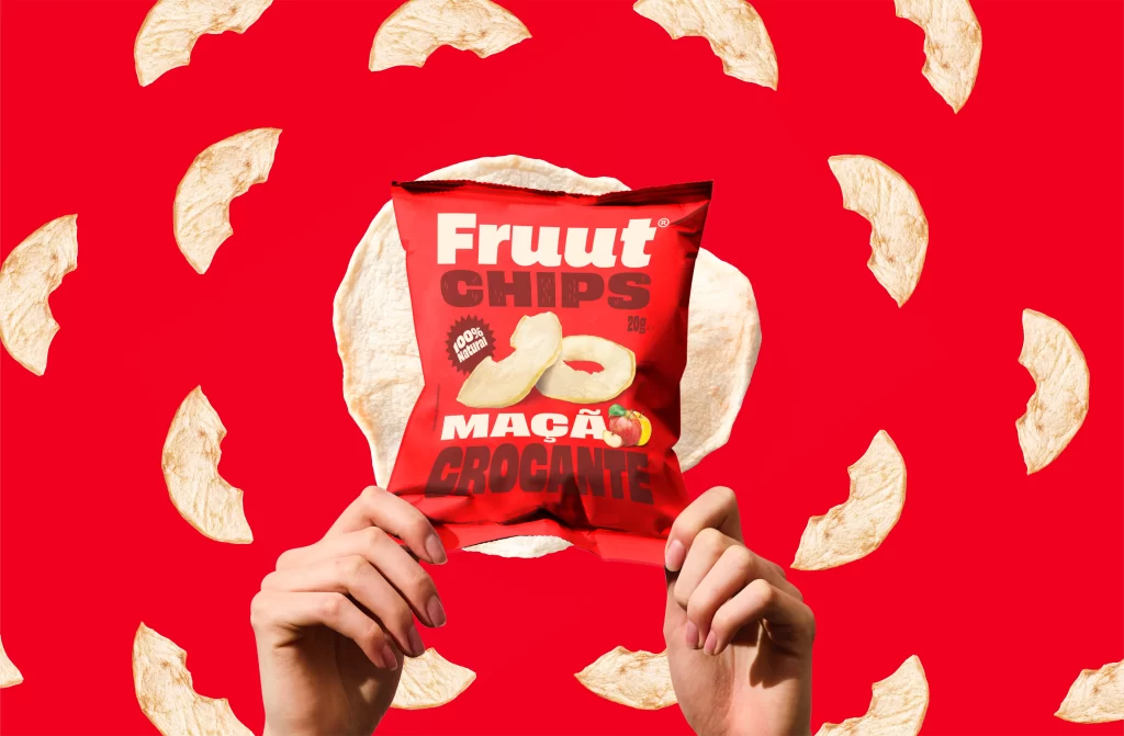
Our suggestion: create delicious, crispy, indulgent product photography, and reorganize the information hierarchy — bold typography, clear benefits, and a structure that grabs attention at first glance. This is impulse buying territory.
A key technical change was to switch the packaging film to a metallic one. Previous versions were made from flexible plastic; the aluminum layer added a crisp sound and feel, instantly communicating freshness and crunchiness.
Another important point — language. Why should we be reading English on a local product? Fruut started adapting its packaging for each country, bringing the brand closer to its customers.
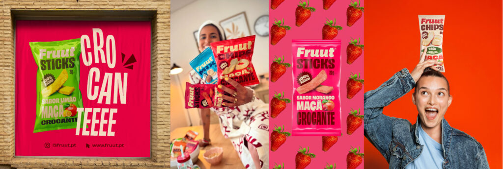
The new Fruut now has a chips-like packaging, with sensory appeal, vibrant colors, and dynamic typography — a true reflection of the brand’s upbeat spirit.

Its new positioning became clear: “Healthy, but with pleasure.” Encouraging consumers to finally swap chips for a 100% natural, guilt-free snack.
Fruut found its perfect recipe — a snack that looks and tastes delicious, crispy, and can be enjoyed by kids and adults alike, with a clean conscience.
“Incredible work, guys. For the first time, I’m 100% happy and proud when I see our social media and the packaging looks BEAUTIFUL in stores. And when I’m happy and proud, I have to share it.”
Filipe Simões, CEO FRUUT
The several packaging updates and branding work led by D’FRONT — winners of several creativity awards — helped solidify Fruut as a vibrant, modern, and confident brand, capable of talking sustainability without losing flavor, and competing with the biggest names in the market with the same crunch that started it all.
Fruut’s journey is a case study in how design and brand strategy evolve with market maturity and consumer perception. From artisanal simplicity to sensory delight, each phase represented a new level of confidence, desire, and relevance.
It’s a story we’re proud to tell — because, over ten years working together, we stumbled, adjusted, and grew side by side. Now Fruut moves forward toward new horizons — and who knows, maybe one day, it will reinvent itself again.
New business: [email protected]