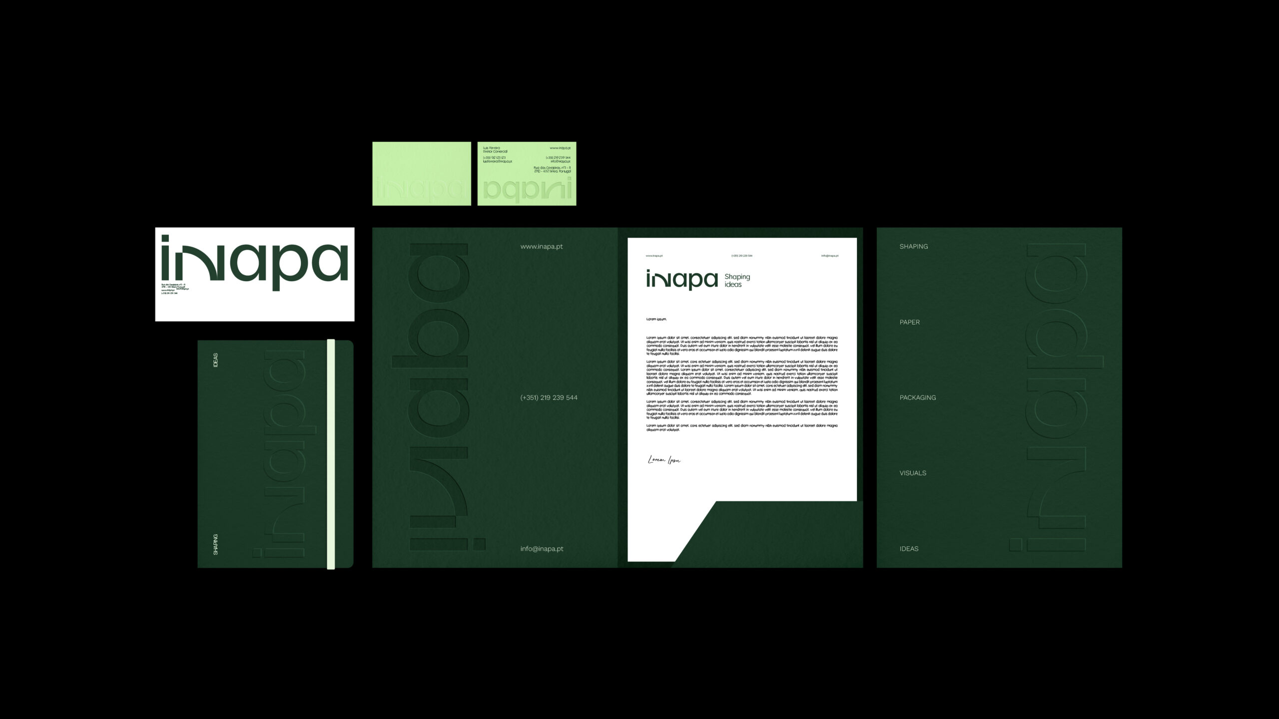
VISUAL IDENTITY
STATIONARY
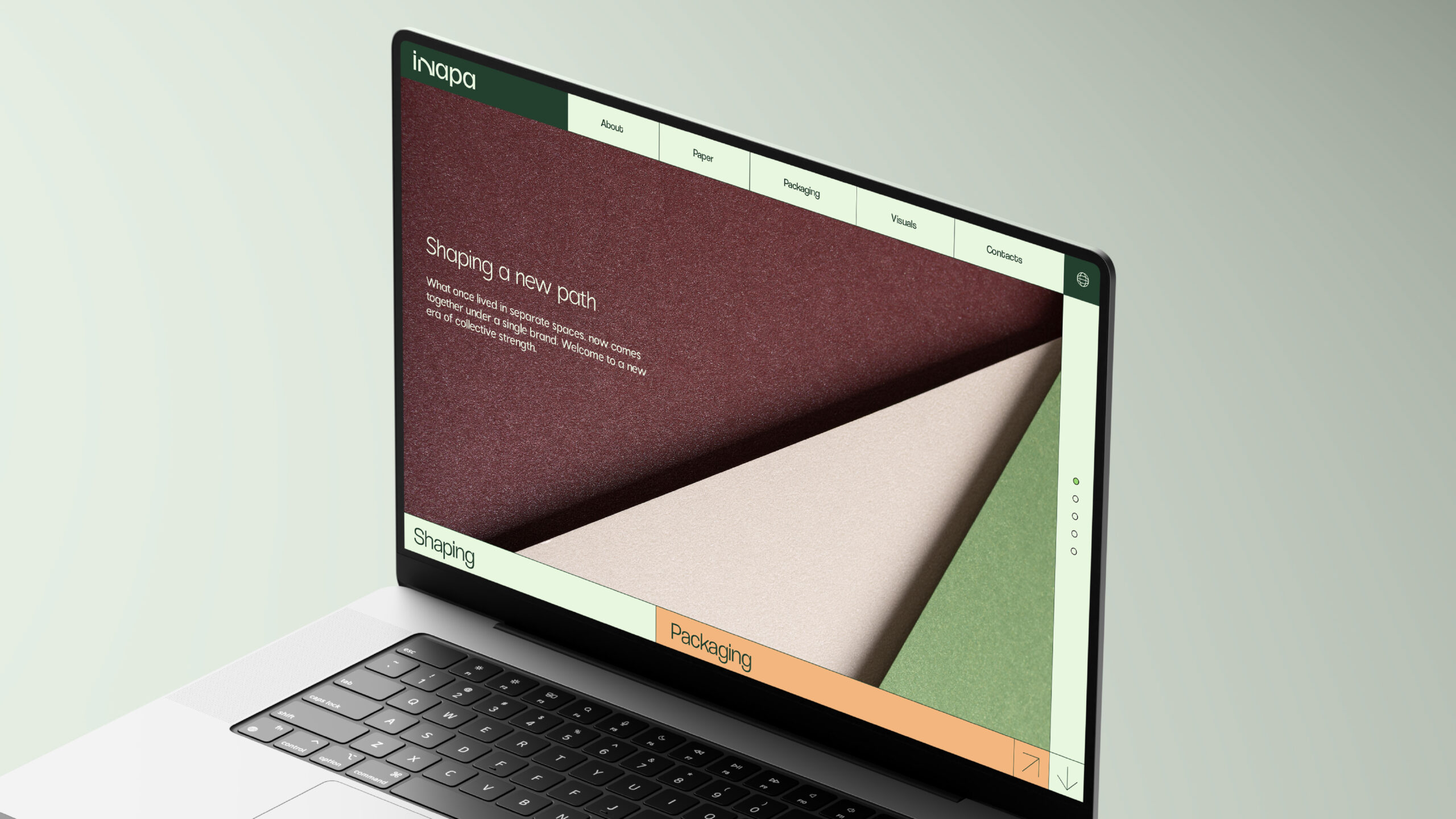
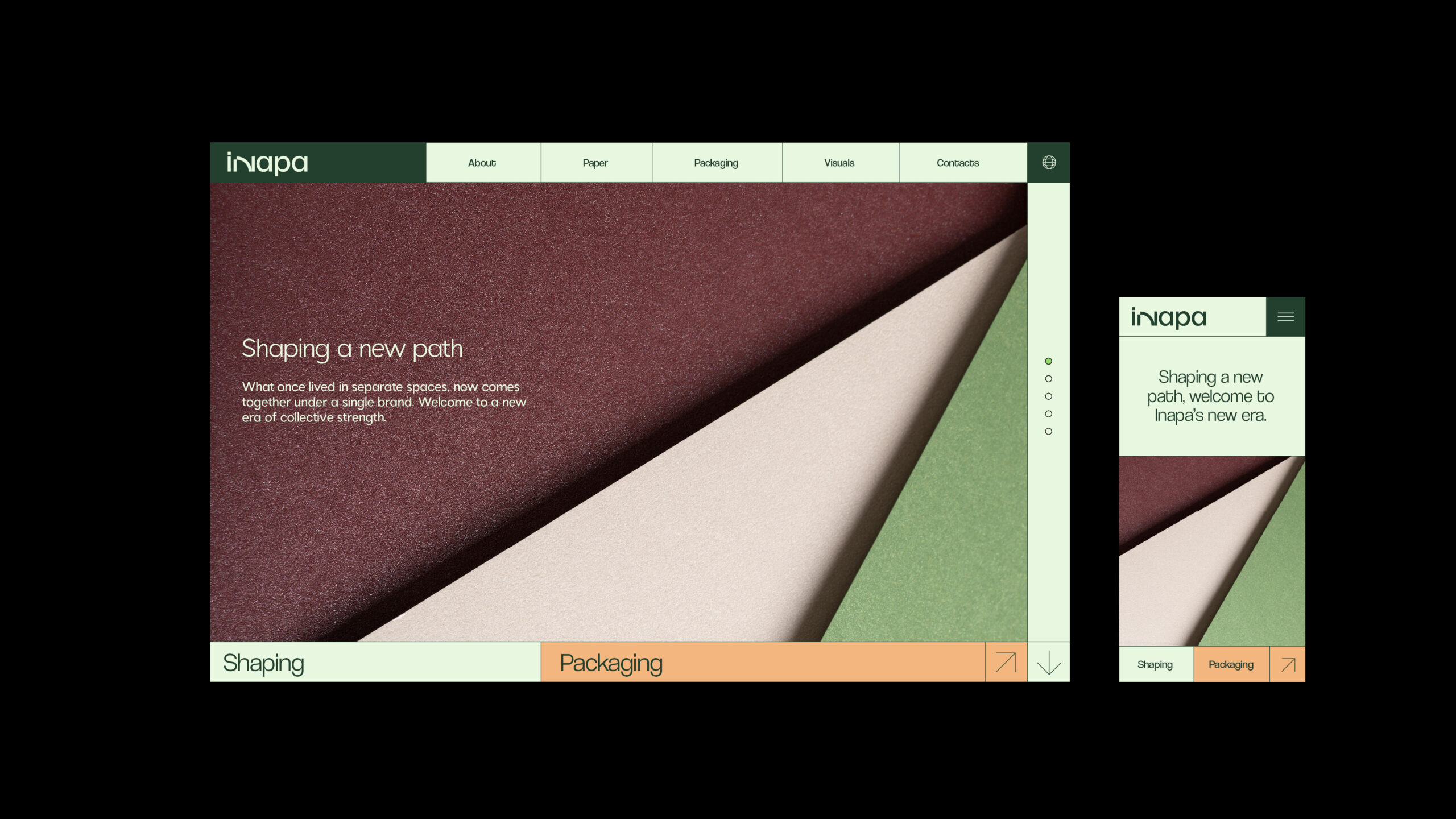
EDITORIAL
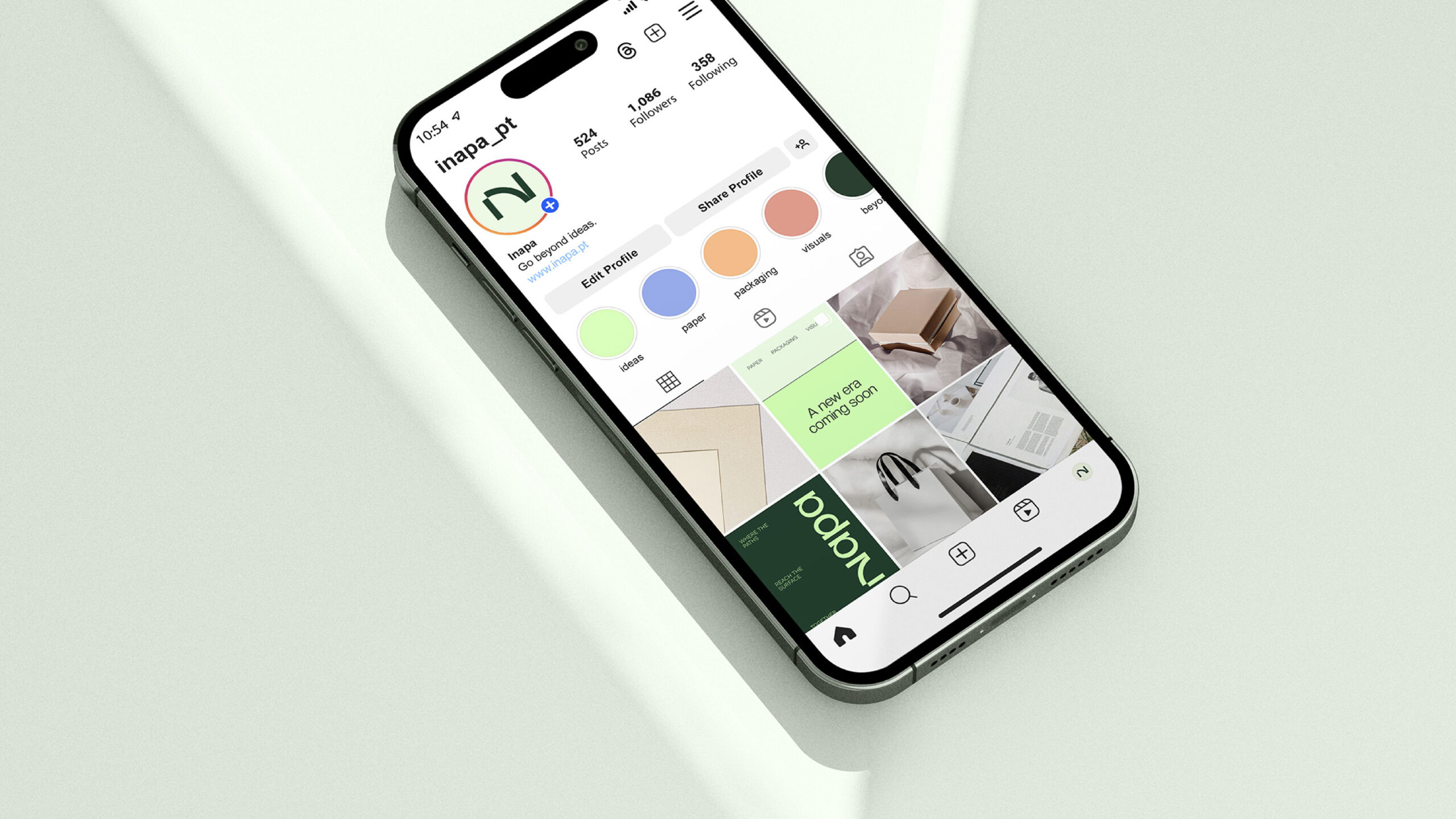
SOCIAL MEDIA
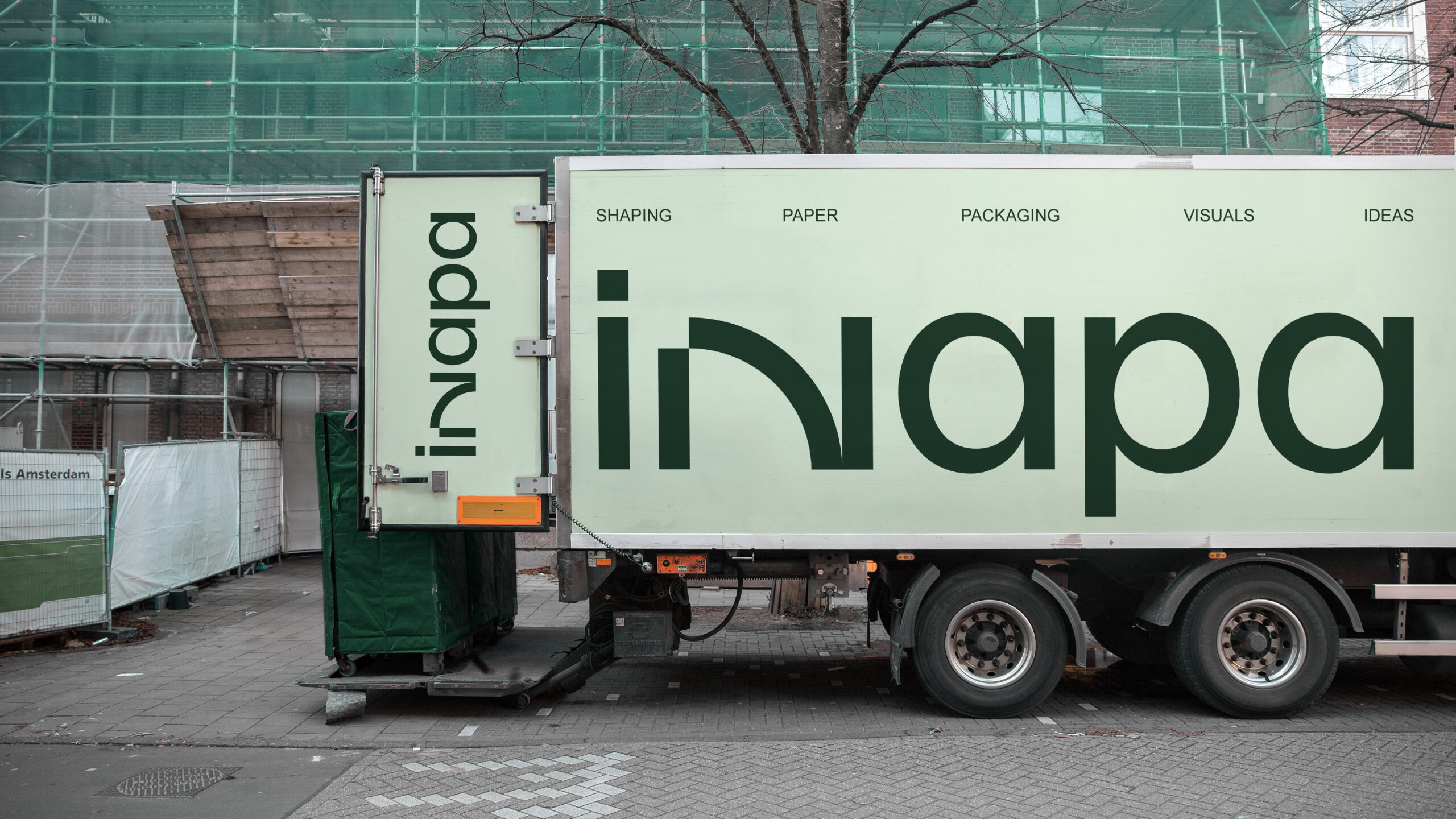
INAPA is a company with over 50 years in the paper industry, with a consolidated international presence. In recent years, the business has evolved beyond paper, integrating new areas such as packaging and visual communication.
AWARDS
BRONZE – LUZOS
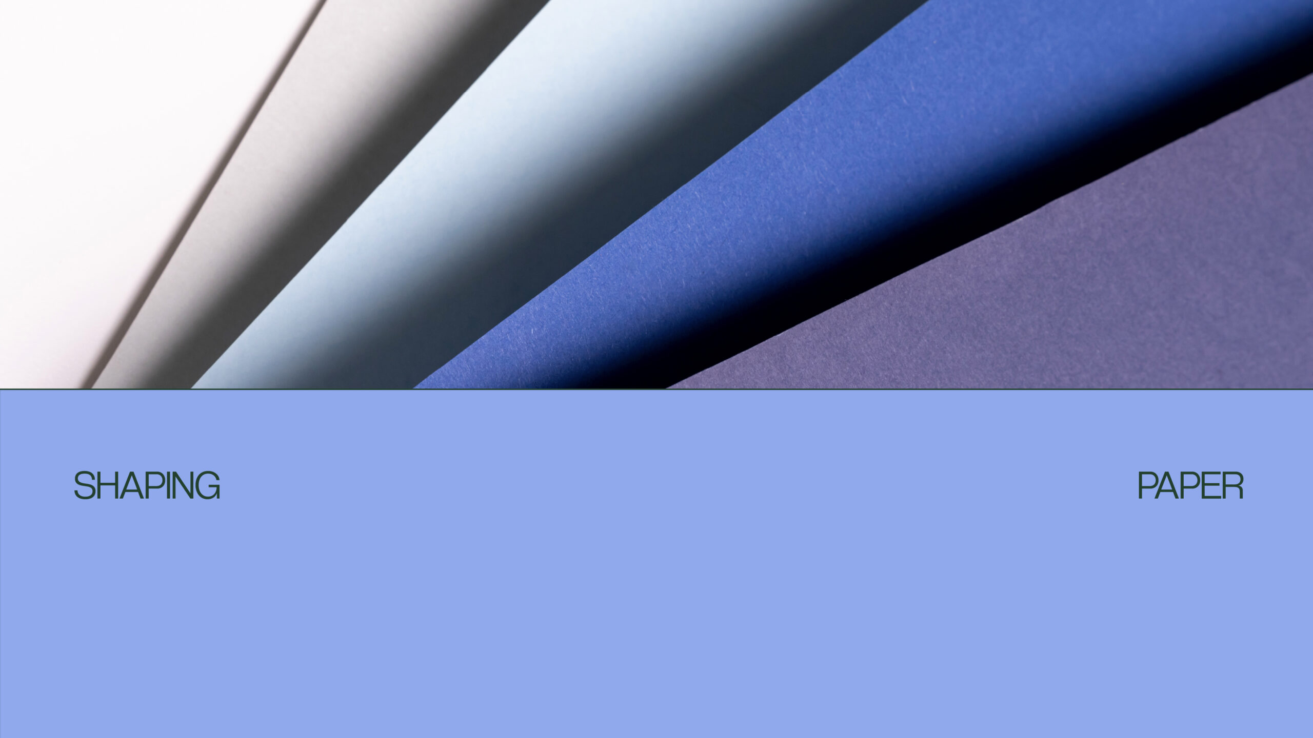
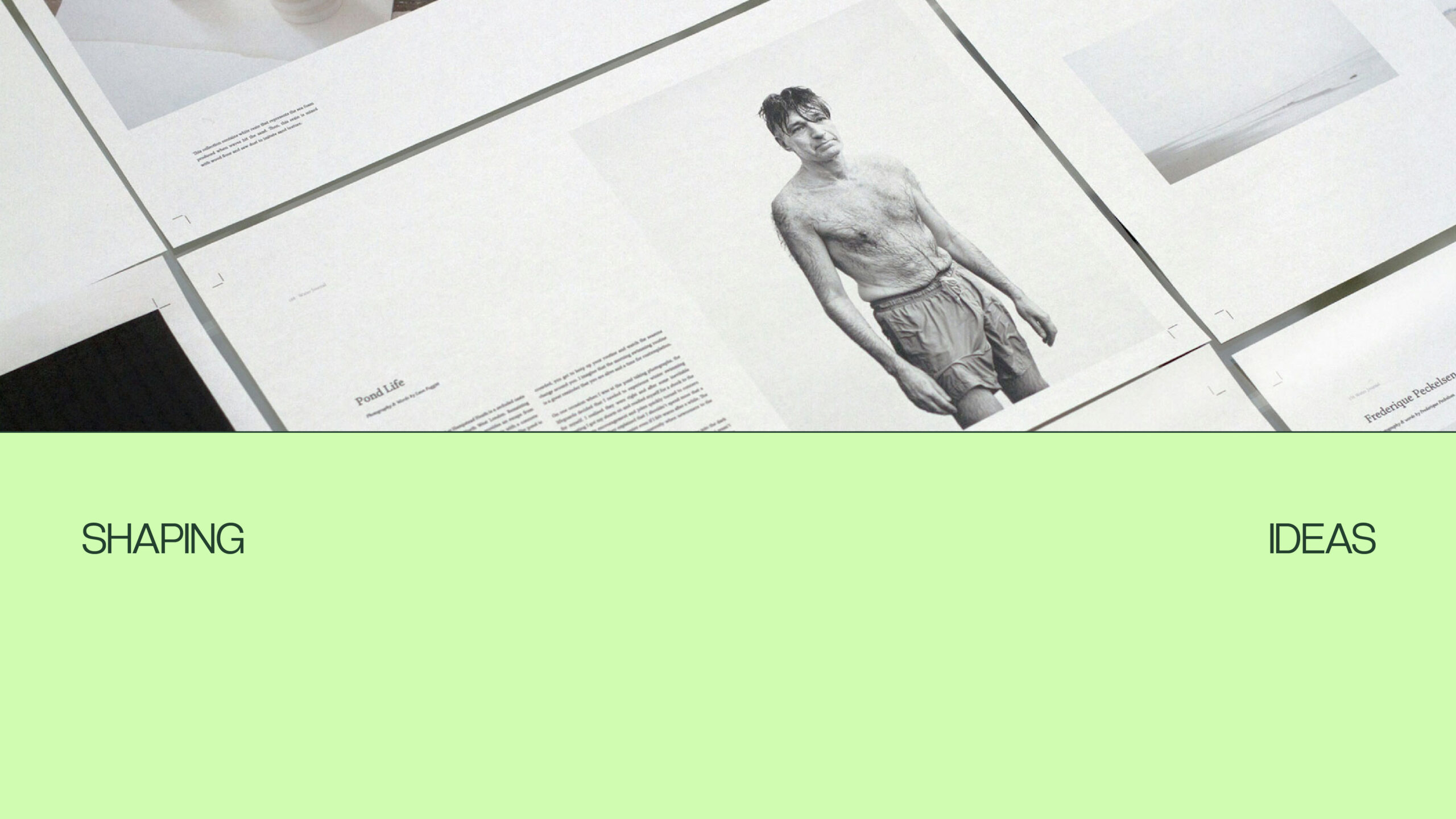
SHAPING IDEAS
The challenge was to reposition Inapa as a modern brand, capable of reflecting this expansion, fostering closer customer relationships, and establishing itself as a complete partner—not just a supplier.
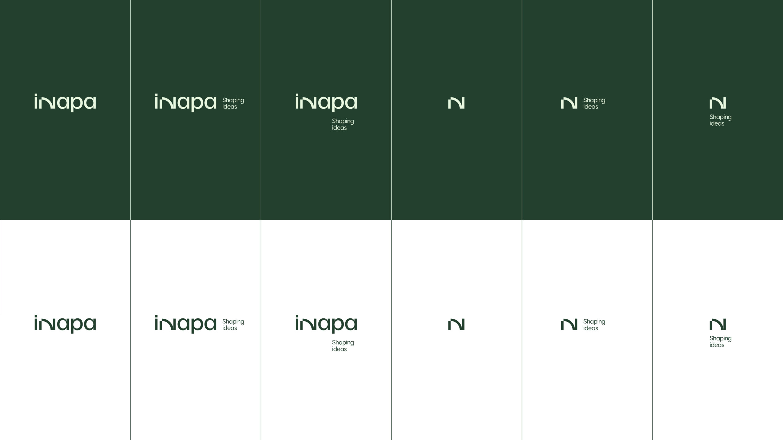
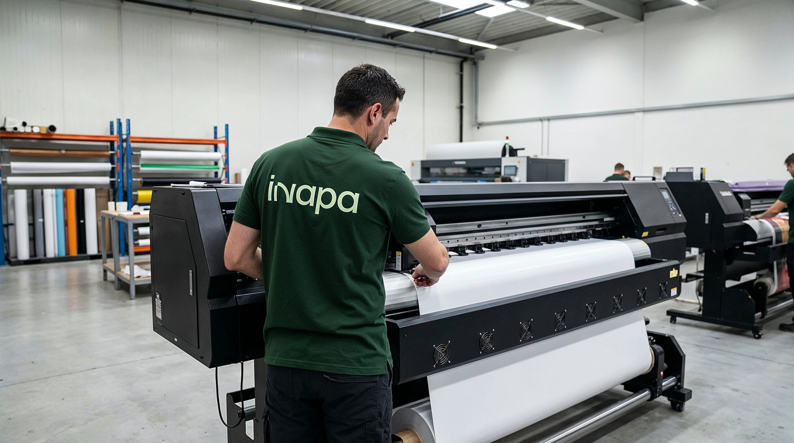
The solution involved unifying the different business areas under a single, clear, and coherent brand. An identity was created that reflects Inapa’s evolution, maintaining its foundation of trust, but with a more modern and customer-oriented language.
The tagline “Shaping ideas” embodies this positioning, reflecting two essential points: the ability to shape clients’ projects with creativity and quality, and Inapa’s role as a partner that empowers these key projects.o.
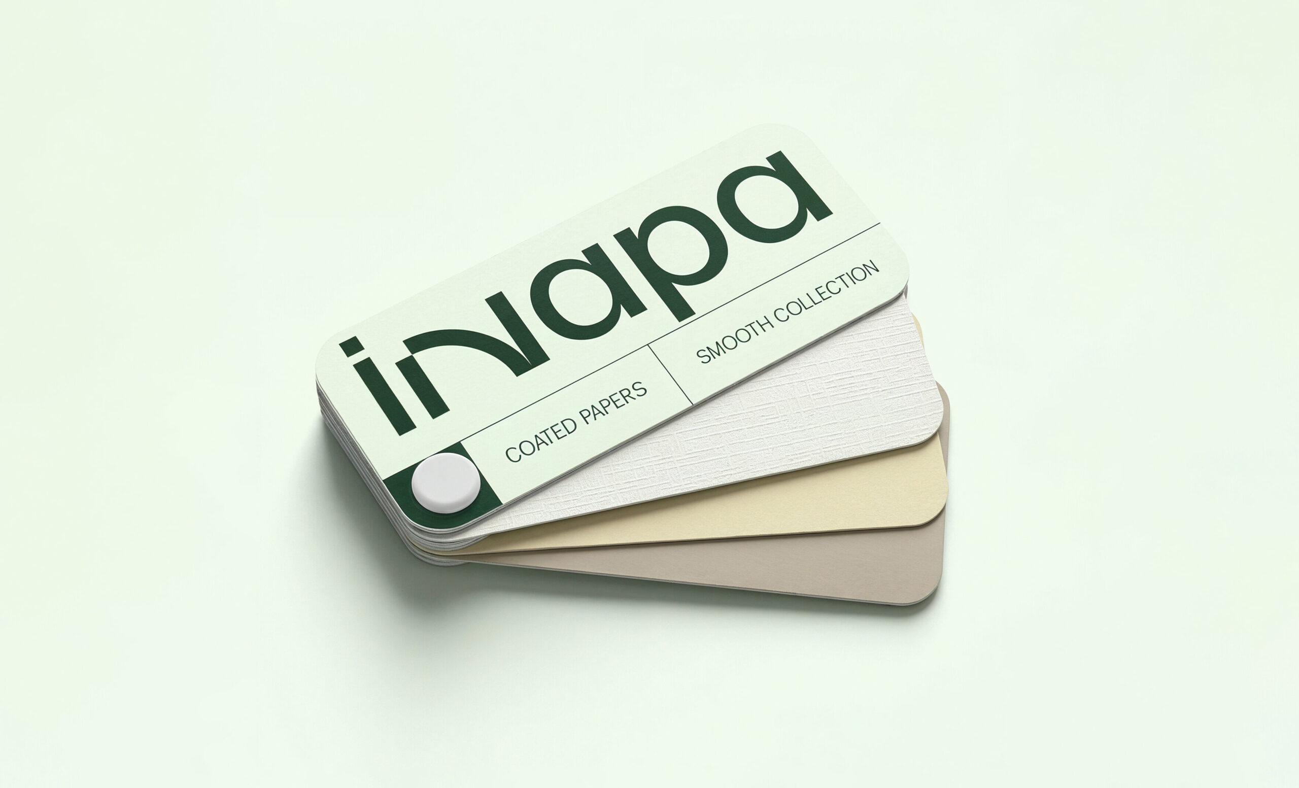
The identity was conceived as a flexible system, capable of organizing and distinguishing the three areas: paper, packaging, and visual communication, while maintaining brand consistency.
The result is a clearer, more approachable Inapa, better prepared to respond to current market needs and taking an active role in the development of its clients’ projects.